Data-projects-with-R-and-GitHub
General Topic:
The project aims to analyze to find how the the frequency of depressive disorder reports changed over time for different age groups, genders, and race-ethnicity categories.
The Data set:
The dataset can be downloaded from the
here
The table displays the proportion of adults who were ever told they
had a depressive disorder in California. It contains data for California
only. The data are from the California Behavioral Risk Factor
Surveillance Survey (BRFSS). The data contains information on annual
number of depressive disorder records from 2012 to 2018. It also
contains number of recorded disorders for different age groups, gender,
education levels, and race-ethicity catrgories. The current stage of the
dataframe is messy and not in a usual tidy form.
Data Manipulation Goals:
The the main task prior to doing some visualization is tidying the given
data.
1. Please make sure that data table has a tidy form (one
observation per row, one variable per column, one value per cell).
- Since the “Percent” values are not relating to the “Frequency” values, thus, please recompute them (per year) to get the respective Frequency-fraction in percent. Create a separate column called “Annual Frequency”. You will use it later for graph.
Visualization Goals:
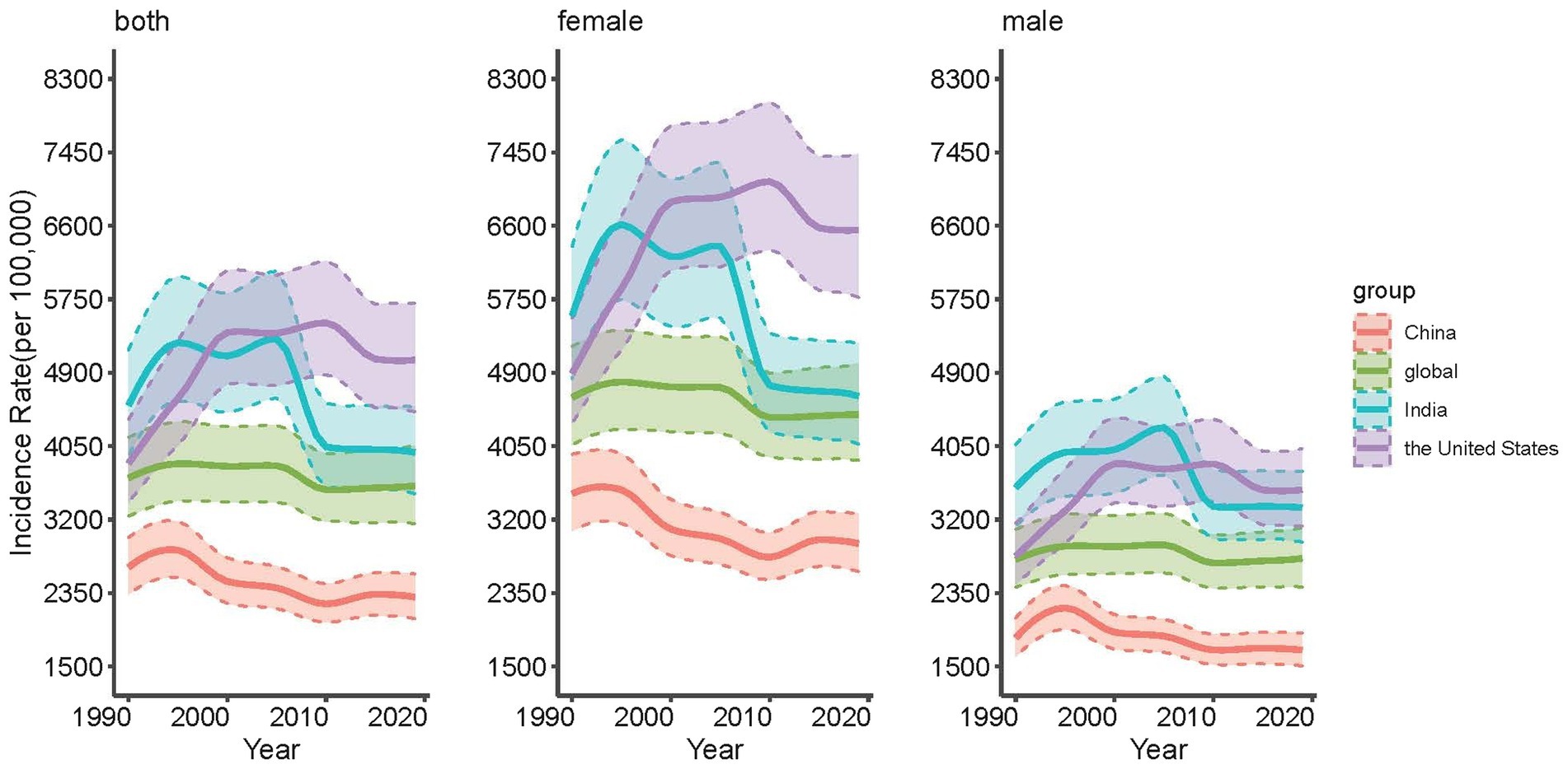
I would like to see some graph like this:
 .
.
This chart is not related to the actual dataset.
1. Plot a
graph with “Annual Frequncy” on the y-axis, and “Years” on the x-axis.
2. Make 3 graphs, where: - (1) lines are colored by “Education
level” - (2) lines are colored by “Race-Ethnicy” - (3) lines are colored
by “Age” categories
3. Make sure that all three graphs appear on
one frame as shown in the example.