Data-projects-with-R-and-GitHub
Data Projects with R and GitHub: Movies and Inflation
Movies are a big and important part of our culture. They are a source of entertainment, a way to tell stories, and a reflection of society. But they are also a big business, with billions of dollars in revenue generated each year. In this project, we will explore the relationship between movies and inflation. We will use a dataset that contains information about movies released between 1970 and 2020, including their ratings, box office performance, and inflation-adjusted gross collections.
The given dataset can be downloaded here. However, please do not download it onto your computer but load it directly into R by using the link.
The dataset provides numerous details about movies which include:
Title: movie title.Release_Year: year of the movie’s release.Watchtime: movie duration in minutes.Genre: genre.Movie_Rating: IMDB movie rating.Metascore: metacritic movie rating.Votes: number of ratings.Gross_collection: incomes generated by the movie.Sinopsis: Short summary of the movies content.Director: Name of the movie’s director.Star: main actors.Gross_equivalent: income generated by movies with dollar devaluation correction.
Tasks for Data clean up:
- Check out the first column. Are the columns unique without the first column? If yes, remove the first column. If not, assign each row a unique ID and name the appropriately.
- Remove special characters from variable name
- Round the numeric values to the closest full number to eliminate all decimals
- Check the variable type of
Movie_Ratingchanged into a date. If yes, change it back to numeric. - Disassemble the ´Genre´variable into a list of individual genres so
that we can use it for data visualization later on. (Hint: use the
nest()function. Use the help page for further information)
Tasks for Data manipulation:
Of course, the first question that comes to mind is: What is the overall
best movie? Find the movie that has got the highest score when combining
Movie_Rating and Metascore. To do so, create a new variable with the
sums of the two scores.
Another relevant measurement is, how much money films made through the
sale of tickets. However, many films are pretty old so we want to learn
more about inflation throughout all the years. For each year: Calculate
the rate of inflation by using the given data of the Gross_collection
variable and Gross_equivalent variable and store it in a new variable.
Some Advice:
- Group data by year
- Calculate sum of
Gross_collectionfor each year - Calculate sum of
Gross_equivalentfor each year - Use mathematical operators to calculate each individual rate of inflation
- Try to write the code as efficient as possible!
Tasks for Data visualization:
Let’s see if there is a correlation between Movie_Rating and
Metascore. To do so, create a scatterplot with Movie_Score on the
x-axis and Metascore on the y-axis. This should eventually look like
this:
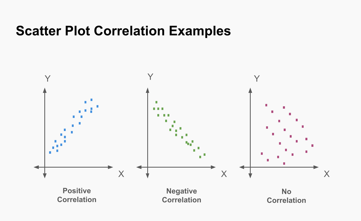 Please also ad a linear trend line to the scatterplot to see if there is
a positive or negative correlation between the two variables. Using the
provided picture: Is there a correlation? Is it positive or negative and
what does it tell us about the relationship between the two variables?
Please also ad a linear trend line to the scatterplot to see if there is
a positive or negative correlation between the two variables. Using the
provided picture: Is there a correlation? Is it positive or negative and
what does it tell us about the relationship between the two variables?
Let’s take a closer look at the role of the different genres. Please
detach the plot into smaller plots, one each for every genre. To do so,
you will also need to use the unnest() function.
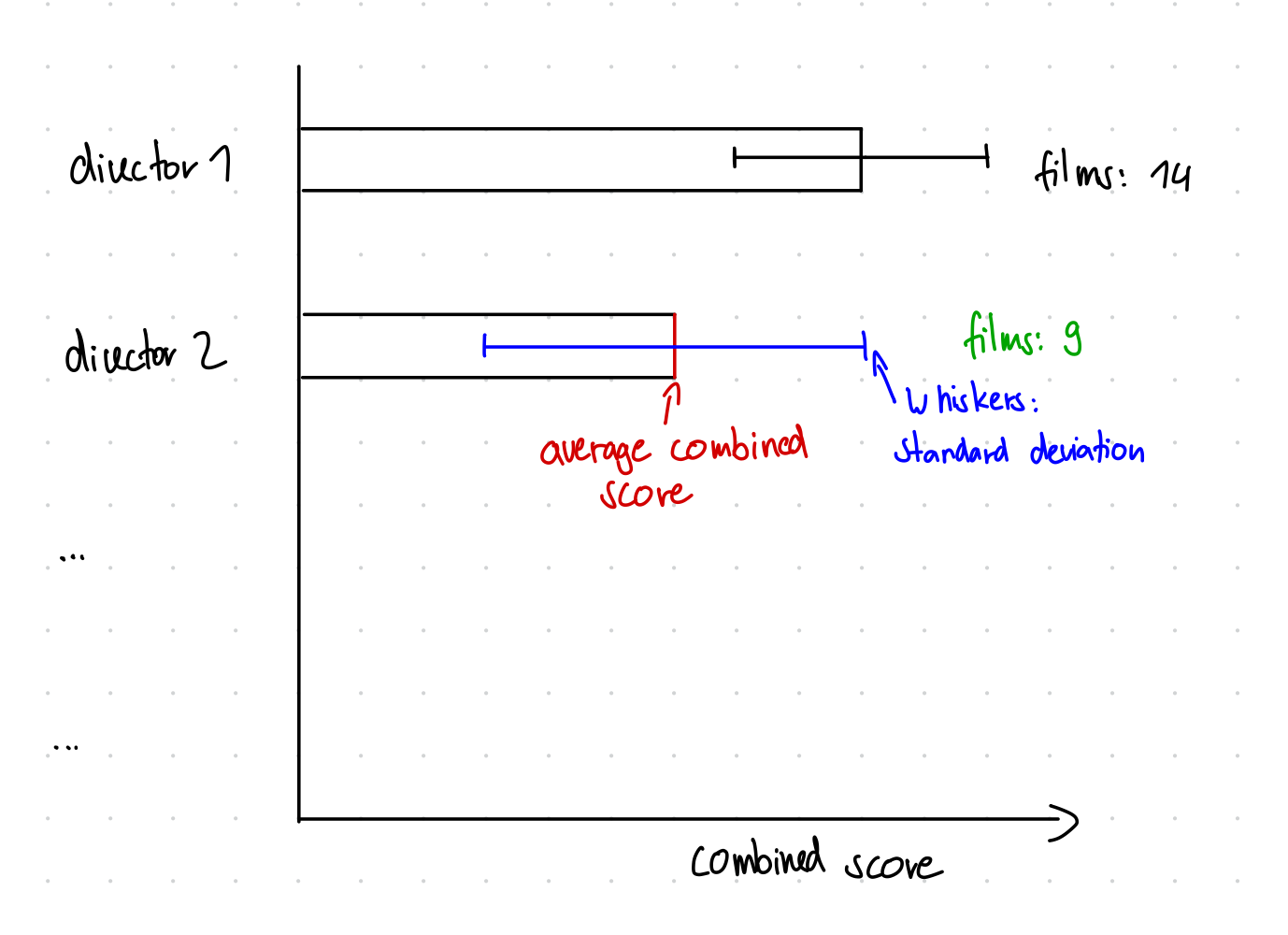
Last but not least: Let’s see how different directors score! Create a horizontal bar plot for each director that shows the average combined score as well as the standard deviation through whiskers and also presents the number of movies next to the bar as a text annotation. At the end it should look somewhat like this:
Optional Tasks:
If you would like to even improve your plot from before: Mark all the films that your favourite actor/actress has participated in with a special color to see how they performed!
Let’s see if films that have a good rating also make more money: To do
so create another scatterplot with Gross_equivalent on the x-axis and
the combined score on the y-axis. What does this correlation look like?