Data-projects-with-R-and-GitHub
The IUCN (International Union for Conservation of Nature) and their “Red List of Threatened Species” aim to draw attention to, and keep track of, how non-human life on earth is faring.
To this end they assess various species and how their populations are
developing over time, sorting them into categories, doubtless you’ve
seen some of these categories before, like Threatened or even
Extinct.
The table you will be working on only covers a small part of the Red Lists scope, namely it provides the number of species from every class and how they are classified according to the red list. (There is also Kingdom data but we will get to that.)
Now Species you’ve all heard before, it is the smallest unit in the
taxonomy of life, defined by members of a species being able to produce
offspring which itself is able to produce offspring.
Class and Kingdom might feel more foreign to you, but it just comes
down to larger umbrellas of life. A Class contains many Species each
- There are also more so-called Taxonomic Ranks in between but we don’t care about those here.
And a Kingdom contains many Classes itself, Kingdom being one of
the highest ranks. One Kingdom for example is Animalia which includes
all animals. Or Plantae which includes all plants.
- Again there are more intermediary steps between
KingdomandClass.
Tasks:
1. Data import and wrangling
a) Import csv into R
I have placed the .csv in my /dependencies folder, you can import it
from there.
| Name | EX | EW | Subtotal (EX+EW) | CR(PE) | CR(PEW) | Subtotal (EX+EW+ CR(PE)+CR(PEW)) | CR | EN | VU | Subtotal (threatened spp.) | LR/cd | NT or LR/nt | LC or LR/lc | DD | Total |
|---|---|---|---|---|---|---|---|---|---|---|---|---|---|---|---|
| ACTINOPTERYGII | 90 | 11 | 101 | 143 | 8 | 252 | 777 | 1359 | 1502 | 3638 | 0 | 890 | 17851 | 5236 | 27716 |
| AMPHIBIA | 37 | 2 | 39 | 187 | 1 | 227 | 825 | 1291 | 814 | 2930 | 0 | 453 | 3733 | 896 | 8051 |
| ANTHOZOA | 0 | 0 | 0 | 2 | 0 | 2 | 32 | 246 | 58 | 336 | 0 | 24 | 431 | 147 | 938 |
| ARACHNIDA | 9 | 0 | 9 | 27 | 0 | 36 | 121 | 165 | 104 | 390 | 0 | 52 | 488 | 114 | 1053 |
b) Visit the Website
Check out the table and the legend below, familiarize yourself with the column names and what categories they belong to.
c) Add Kingdom data
On the website you will see that they also have data on which Kingdom the various Classes belong to, we want to add this data semi-automatically.
-
Manually note the different Kingdoms and in what order they appear in the online table.
-
Use
lag()and/orfill()alongside the fact that the table is ordered lexicographically by Class-name within each Kingdom to automatically find the boundaries between the different Kingdoms. -
Add the Kingdom information in a new column named
Kingdom
2. Data Manipulation
a) Remove unwanted columns
The legend on the website also explains that Possibly Extinct and
Possibly Extinct in the Wild are not classifications from the IUCN, as
such take them out of your table. Then also remove the column
Subtotal (EX+EW+ CR(PE)+CR(PEW)).
c) Simplify columns
I dislike the following categories:
-
LR/cd - Lower Risk/conservation dependent -
NT - Near Threatened (includes LR/nt - Lower Risk/near threatened)
I want you to restructure them by integrating them into one singular new
column, which is made up of the sum of both. Call this column
Near Threatened and remove the old ones.
d) Make column names readable
The website also has an explanation of the column names at the bottom, look them up and replace the column names with the easier to read full names of the categories, shorten in a way where:
-
The columns should at the end all have names that are in line with
Near Threatened. -
They remain unique.
3. Data Visualisation
a) Create relative amount table
Before you start visualizing, create a separate table. In this table,
each of the columns, except the Total column, contain the percent of
the Total they make up row-wise.
-
So if in the old table, a row contains a
Totalof 200 and anEXof 8, the new table would say 4 in theEXcolumn. -
The
Totalcolumn should always display 100 -
Also give the column names an update so it says
<ColumnName> [%]
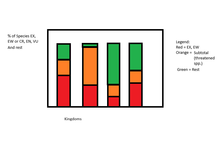
b) Visualize difference between Kingdoms
We want to compare the different Kingdoms, especially if they have been affected to different extends:
To this end, create a bar plot as in the picture, one bar per Kingdom. Exclude any Kingdoms that have a total of less than 1000 Species from the plot.
The y-Axis contains the percent of species in that Kingdom that fall
into various categories colored as in the picture. The categories are:
-
Extinct:
EXorEW -
Affected:
CR,ENorVU -
Unaffected or no data: Rest
Make sure you find better labels and names for the Legend and the Axis labels.
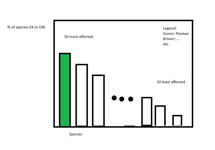
c) Visualize most and least affected Classes
Next we are interested in the most and least affected Classes, as well
as which Kingdom they belong to:
Affected here is defined as the “Percent of at least Critically Endangered Species in a given Class”
Create a bar-plot that contains (from left to right):
-
The 10 most affected Classes, ordered from most to least.
-
Three dots like in the provided picture.
-
the 10 least affected Classes, ordered from most to least
Make sure to also:
-
Color the bars according to the Classes’
Kingdomand place a legend that explains the colors. -
Label every bar with the appropriate
nameof the Class and make sure it looks good (you might want to use diagonal labels or other tricks)