Data-projects-with-R-and-GitHub
General Topic
The dataset provides information on air quality surveillance in New York City. Air pollution is a significant environmental threat to urban populations. While everyone is exposed to air pollutants, the levels of emissions, exposure, and population vulnerability differ across neighborhoods. These indicators offer insights over time and across NYC’s geographic areas, helping to better understand and characterize the city’s air quality.
The Dataset
The dataset is already available in the project folder under “Air_Quality.csv”. The Dataset has been published by Department of Health and Mental Hygiene (DOHMH) on the Open-Data. The dataset consists of csv/rdf/json/xml file with 12 attributes. Name/Geo Type Name/Start_Date/Data Value are relevant for my project. Under landing page you can find more information.
Manipulation Goals
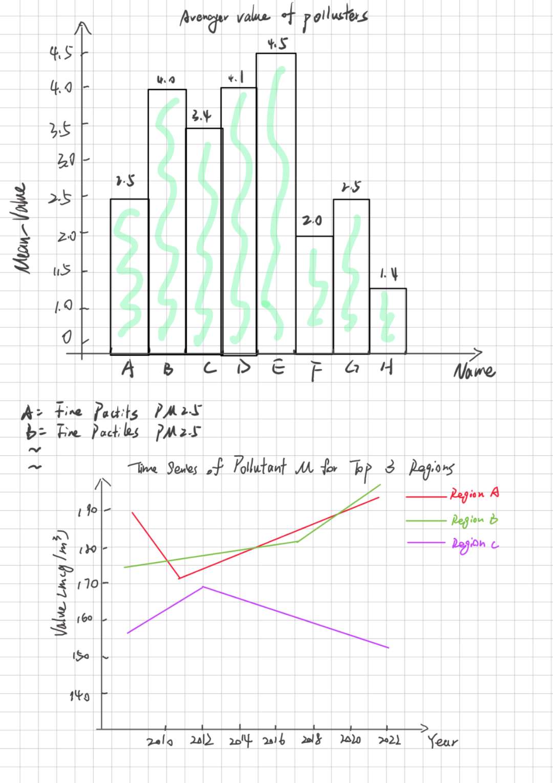
The variety of data types can lead to a number of different analytical directions, such as temporal changes of a pollutant in different regions, or comparing mean values of different pollutants.
Visualization Goals
I want to compare the mean values of different pollutants and give the
time variation of the pollutant with the highest pollution value in top3
regions. For the first task I would use a geom_bar for comparison and
then a geom_linie to analyze the second situation. 