Data-projects-with-R-and-GitHub
Charlottes Project 🐌🐌🐌
🐌 0: Dataset
The dataset focuses on guest students at universities and other higher education institutions by gender in NRW.
ndefinedI obtained the dataset from the GOVDATA website, a platform for data from Germany. The data provider is the Open.NRW portal.
🐌 1: Data Cleaning
-
Load the dataset
https://www.govdata.de/suche/daten/gasthorer-nach-hochschularten-hochschulen-und-geschlecht-land-wintersemester )
Make sure to load the data direclty from the internet rather than downloading it to your computer first. -
Set the character encoding explicitly
Ensure that special characters (e.g.ä) are displayed correctly by setting the appropriate character encoding. -
Clean the end of the table
Remove any unnecessary rows or artifacts at the end of the dataset. -
Handle missing data
Replace missing data withNA.\- If information is missing for only one category, calculate the missing value. For example:
"insgesammt" - "männlich" = "weiblich
- If information is missing for only one category, calculate the missing value. For example:
-
Extract hierarchy from leading spaces
Use the leading spaces before university names to identify their “hierachy” (Entries with fewer leading spaces represent higer level categories).
Add a new column that reflects this hierarchy. -
Remove leading spaces
Once the hierarchy i extracted, delete the leading spaces from university names. -
Name the columns
Add meaningful names to all columns in the dataset -
Create new variable
From the three universities Bielefeld, Bochum and Bonn create a new variable that shows the sum of “männlich”, “weiblich” and “insgesamt” for each year. -
Important: The Dataset is arranged in a way that is (in my opinion) not intuitive. Maybe try to arrange the data differently to make it easier to work with
🐌2: Data Visualization
First part: create the plot
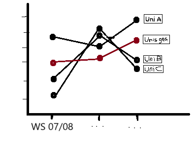
Your visualisation should look something like this. Don´t forget to put a header and axis label that fit the data.

-
the x-axis should be the wintersemester, the y-axis the number of guest students (“Insgesamt”)
-
Chose the universities Bielefeld, Bochum and Bonn as well as the variable you created in step 1 (i called it “Unis ges.” in my sketch but feel free to find a more fitting name).
-
The dots for the WS and number of guest students for the universities should be connected with thin lines.
-
At the end of the line, the name of the university should be placed in a box with a black border
-
All lines and points should have the same color, except the lines and points for the variable ‘Total Universities,’ which should have a unique color
Zweiter Teil: animate the plot :)

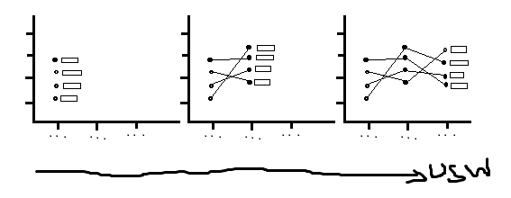
Attempt to animate the graph with gganimate(). Initially, only the data points for the winter semester 07/08 should be visible, followed by lines connecting to each subsequent winter semester, and the labels for each line should animate along with it.
Try out if the animation is visible via markdown. If not you have to create a HTML output.