Data-projects-with-R-and-GitHub
Introduction into the topic
Salvador et al. (2023) published a research article on age-dependent immune and lymphatic responses following spinal cord injury to better understand the lifelong disabling effects that can result from such severe injuries Publication.
The study investigates how the immune and lymphatic systems respond to spinal cord injuries in young and old mice. The researchers used a technique called single-cell RNA sequencing to study the activity of individual cells by measuring which genes are turned on in each cell (scRNA-seq).
Data
The data is publicly available on the Gene Expression Omnibus (GEO) under the accession number GSE205038. The pre-analyzed data set mmc4.xlsx is already provided on GitHub Data file. To give you an idea how the data looks like:
| gene | logFC | p_adjust | ID | Description | GeneRatio | BgRatio | pvalue | p_adjust_2 |
|---|---|---|---|---|---|---|---|---|
| Lars2 | 1.705496 | 0 | GO:0045766 | positive regulation of angiogenesis | 11/109 | 188/23328 | 0 | 3.2e-06 |
- logFC: log2 fold change in gene expression between experimental and control conditions (positive values indicate upregulation and negative values indicate downregulation)
- ID: identifier of the associated gene ontology (GO) term or pathway
- Description: a description of the biological process associated with the GO term.
- GeneRatio: the ratio of genes in the GO term to the total number of genes in the analysis.
- BgRatio: not relevant for the data manipulation & visualization tasks
Data manipulation
- The excel data file contains multiple sheets, so the first task is to get familiar with the data file. Find the sheet “Aged vs Young Macrophages”.
- Extract the sheet “Aged vs Young Macrophages” so that you can load it into R. It contains the differentially expressed genes (DEGs) and the GO terms for different time points (naïve, 3dpi, 7dpi, 14dpi). We are only interested in the naïve aged macrophages vs. naïve young macrophages comparison.
- Seperate the data into two data frames: one for the DEGs and one for the GO terms. The DEGs data frame should contain the columns “gene”, “logFC”, “p.adjust”. The GO terms data frame should contain the columns “ID”, Description”, “GeneRatio”, “BgRAtio”, “pvalue”, “p.adjust”. (Be careful with the column names, two columns have the same name! Rename the columns if necessary.)
Now let’s take a look at the DEGs:
- Create a new column called logFC_high that is TRUE if logFC > 2 for a gene of “naïve aged macrophages vs. naïve young macrophages” , and FALSE otherwise.
- Filter the DEGs to include only those with p.adjust < 0.05, and return the top 10 genes with the highest logFC. Please display the top 10 genes in a nice table.
Now, we will focus on the GO terms to get on rough idea what biological processes, but not individual genes, are upregulated.
- Filter the upregulated GO terms to include only those whose description contains keywords such as “angiogenesis”, “immune response”, “immunity”, “cytokine”, “vasculature”, “wound”, “inflammatory response”, “chemokine”, “lymphatic”, “lymphocyte”, “macrophage”, “monocyte”.
- Remove the columns “BG_Ratio”, “pvalue” and “ID”.
- After the two steps you end up with the three columns “Description”, “GeneRatio”, and “p_adjust_2” that are of interest for the second visualization task.
Data visualization
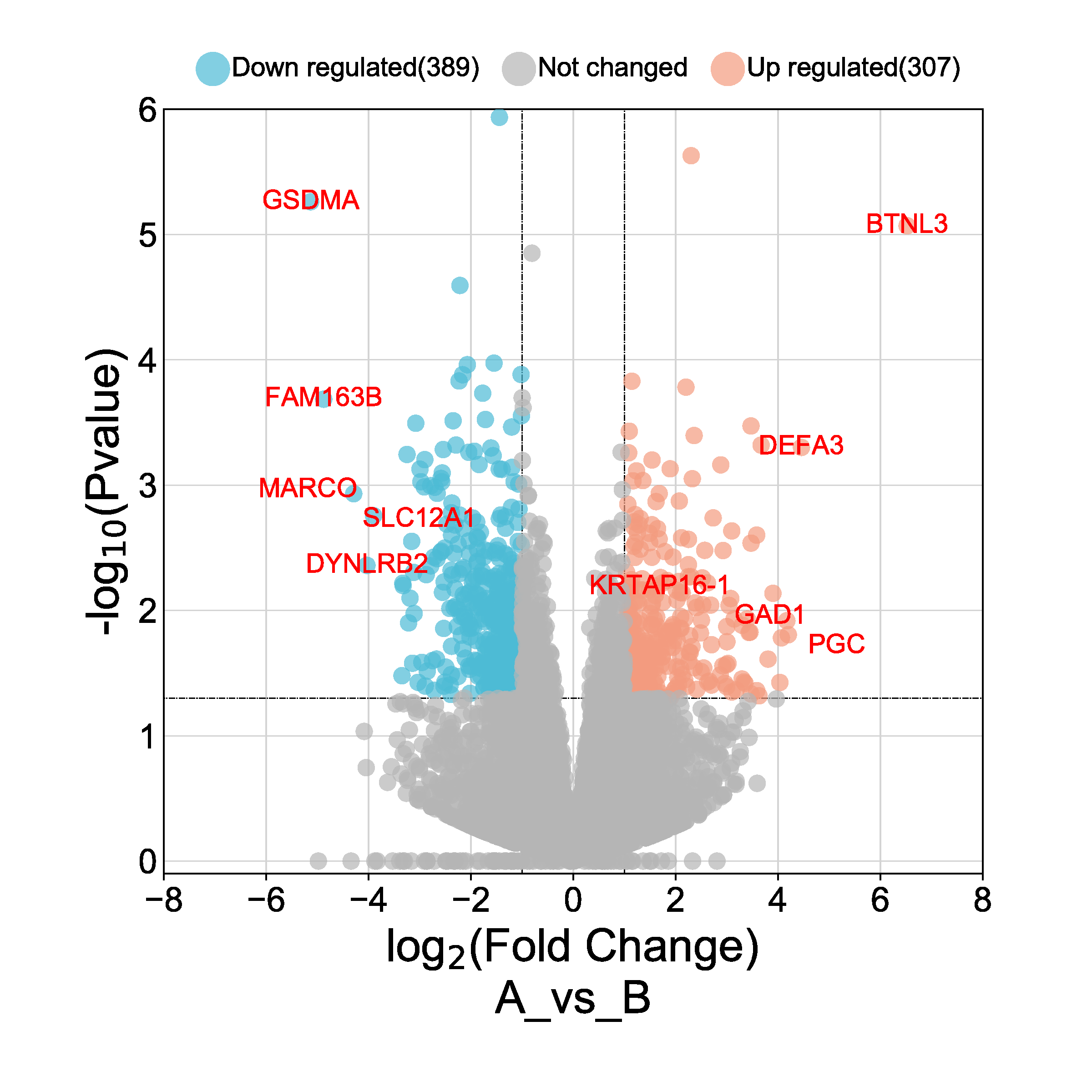
- Create a volcano plot for all DEG genes. On the x-axis display log2FC for all genes and on the y-axis display –log10(adjusted p-value) (the negative log10 of the adjusted p-value) for all genes. Add a horizontal line at -log10(0.05) and a vertical line at logFC = 2 and logFC = -2.
- Color the points based on the logFC_high status (TRUE or FALSE) and label the points with the gene names.
- Label the axes accordingly and add a title. I added a picture to
make it easier to understand what a volcano plot is:
- Create a dot plot with GO terms on the y-axis sorted by descending GeneRatio on the x-axis.
- Use a single-color gradient to indicate significance based on the adjusted p-value (non-significant terms in a lighter shade and vice versa).
- Include a clear legend explaining the color intensity (significance).
- If you can find the time: Present the GeneRatio as the size of the dots in the dotplot.
The data wrangling and the volcano plot will certainly take up a lot of time. That’s why the dot plot is more for when you still have time to spare.
I’m looking forward to your solutions! Good luck!