Data-projects-with-R-and-GitHub
Reproduce this super nice chart!
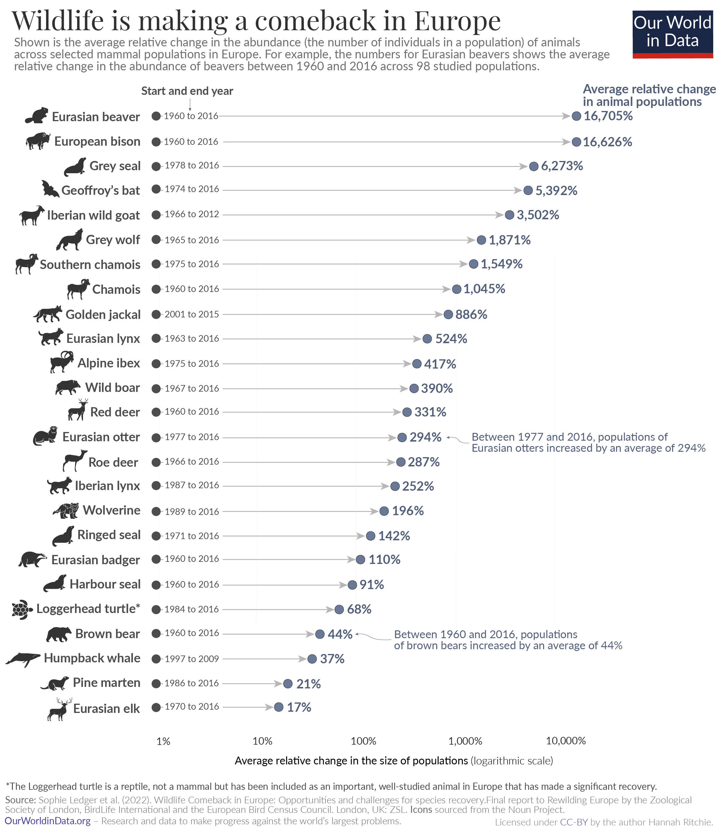
It is often that you find a chart that you really like but have no idea how to do. An example might be the following one (click to enlarge).
Which is shown and detailed on https://ourworldindata.org.
Goal of the project
The idea of this project is to recreate this plot as close as possible
using ggplot and the data available in the provided CSV
file
with the following content (first lines):
| Common name of species | Species name | Number of mammal populations included | Start year | End year | Average relative change in abundance |
|---|---|---|---|---|---|
| Eurasian beaver | Castor fiber | 98 | 1960 | 2016 | 16705% |
| European bison | Bison bonasus | 20 | 1960 | 2016 | 16626% |
| Grey seal | Halichoerus grypus | 18 | 1978 | 2016 | 6273% |
| Geoffroy’s bat | Myotis emarginatus | 12 | 1974 | 2016 | 5392% |
| Iberian wild goat | Capra pyrenaica | 9 | 1966 | 2012 | 3502% |
Visualization priorities (from high to low)
- line style with animal name labels
- percent labels at line ends
- time range label at line start
- x-axis marks
- arrow line style
- annotation of brown bear
- text coloring
- relative font sizes
- animal symbol for brown bear

Let’s see how close you can get! As a starting point, you might want to have a look at The R Graph Gallery.
Looking forward to see your solutions!
Best, Martin
